Logo and Branding Guidelines
Oakville Home Flood Education and Protection Program
How can a city adapt to extreme weather caused by climate change?
See the full brand guidelines here.
The Oakville Home Flood Education and Protection Program is being designed by the Intact Centre on Climate Adaptation and will provide practical, user-friendly resources to help homeowners take proactive steps to reduce flood risk and protect their properties.
As their former co-op student, I had the pleasure of bringing my branding knowledge to help create the logo and brand guidelines for this project.
Background
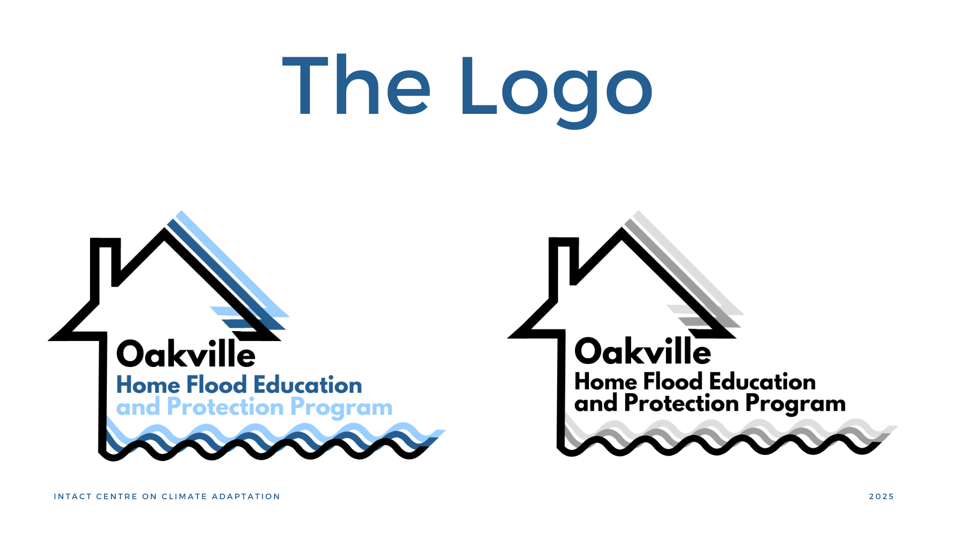
Final Logo Description:
The logo was designed to clearly represent the concepts of "flood" and "home." To communicate strength and protection, I used sharp angles, while the clean, sans-serif font keeps the design modern and readable.
Rationale:
I focused on balancing the design elements to ensure the logo remains recognizable, whether displayed on handouts or websites, at any size. The final logo effectively reflects both the severity of the flood element and the security of home, aligning with the brand’s core message.
Ideation and Sketching
Concept Development/Design Process:
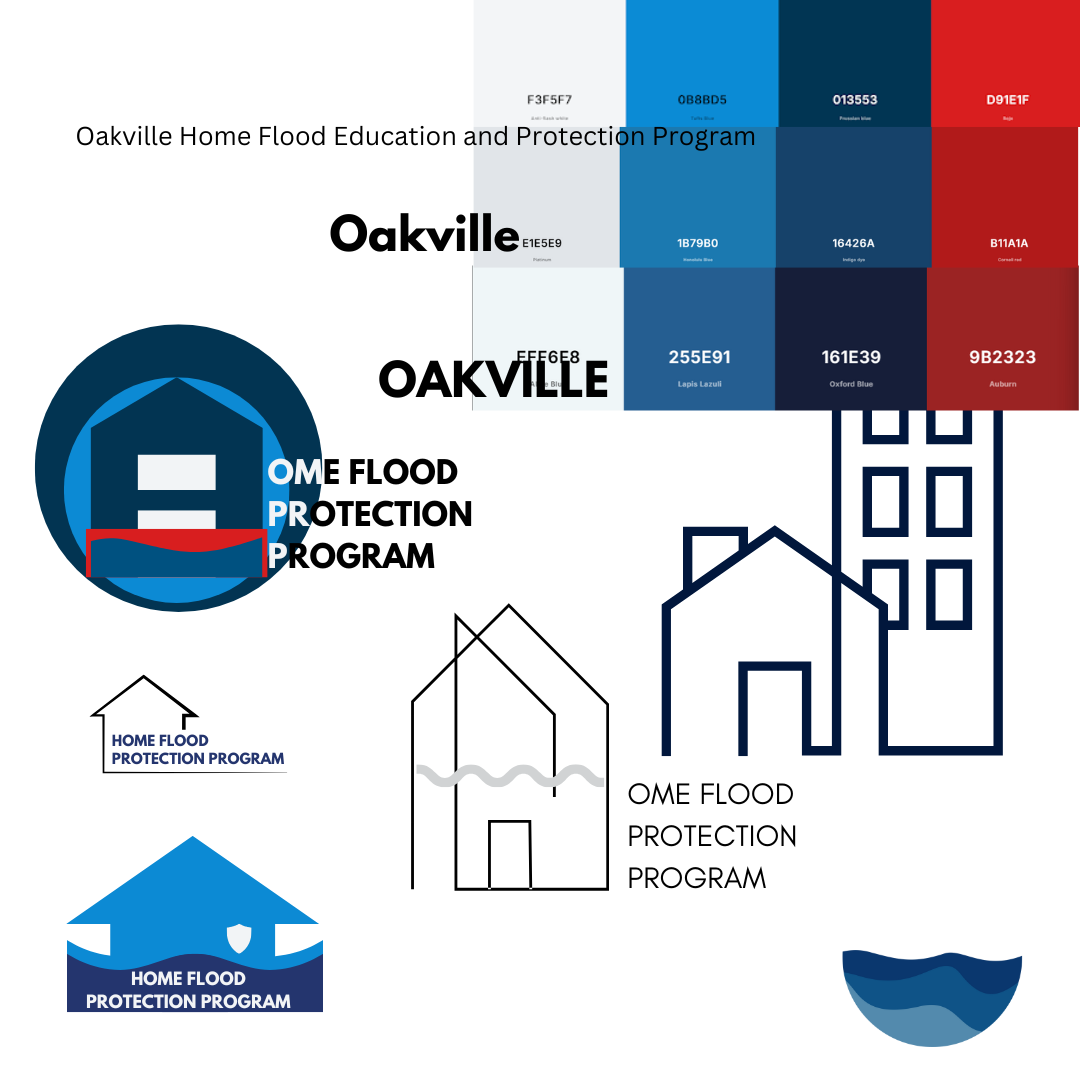
I began sketching variations of these concepts, experimenting with different shapes and layouts. Early drafts focused on merging the idea of water (waves) with the stability of a house. I was also inspired by flood protection barriers, which are commonly seen in a bright red color.
I experimented with the saturation, warmth, and hue of the colors, while also weighing the balance between artistic style and simplicity, considering whether to include buildings or focus solely on homes.
Client’s Vision:
The client aimed to create a logo that reflected their mission of engagement and empowerment. They wanted the logo to symbolize security, community, and resilience, aligning with their commitment to protecting homes and fostering a sense of safety.
Challenges:
The design needed to incorporate elements that visually conveyed these concepts—specifically using a house symbol to represent security and community, and waves to symbolize resilience and adaptability. The logo also had to be clear in its message of protecting homes, while remaining professional and approachable.

Final Color Palette Description:
For the final design, I opted for a simple and versatile color palette, focusing on blue to represent trust, stability, and resilience. To ensure adaptability, I also created a black-and-white version of the logo, maintaining its impact and recognizability across various mediums and applications. The use of a single color simplified the design while reinforcing its professional and approachable tone.
In the branding guidelines PDF, I included slides that outlined how customers can discover the company and how it effectively communicates with its target audience. By presenting this information in an organized and visually engaging format, the PDF ensured that the company’s communication strategy was both accessible and actionable for its team.
Reflection
The project pushed me to balance creativity with clarity: from a meaningful logo design to refining the communication strategies. This, in itself, is an indication of how visual design needs to be married to the mission of a brand, yet be flexible across platforms. In the process, working with the client improved my skills of incorporation and refinement of ideas. This has given me hands-on experience in distilling down critical information to effectively present it within a branding guideline that will hopefully equip businesses to better serve their audience and achieve their purposes.