Logo Design
MAI Badminton
Discover
My client, Mr. Minh Mai, is driven by a passion for badminton and aims to share that enthusiasm by establishing his own weekend badminton program to inspire and engage others.
Brainstorm
Mr. Mai envisioned a clean, professional logo that seamlessly combined the letter 'M' with a badminton birdie. His goal was to create a design that was both minimalistic and instantly recognizable, suitable for use on his website and T-shirts.
Research
Most other badminton clubs are operated by towns or schools, often functioning as seasonal, non-profit organizations with membership fees. Their logos commonly feature a badminton birdie as a central design element.
Sketch
I developed a series of sketch variations, integrating the birdie’s base, pipe, and feather top with the letter ‘M.’ After the first few, I sought feedback on key design elements, including line thickness, angles, shapes, and textures, ensuring a refined and cohesive result.
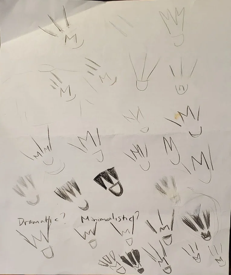
The early concept sketches.
Design
Using Canva's versatile tools, I combined elements such as triangles, and semi-circles, text and color to conceptualize the initial logo design.
Throughout the creative process, I actively engaged Mr. Mai for feedback, ensuring the design aligned seamlessly with his vision and expectations.

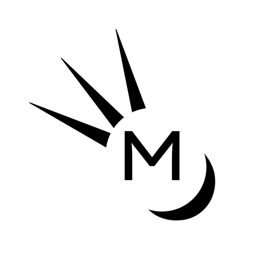
The tow early variations of the logo.
Present & Deliver
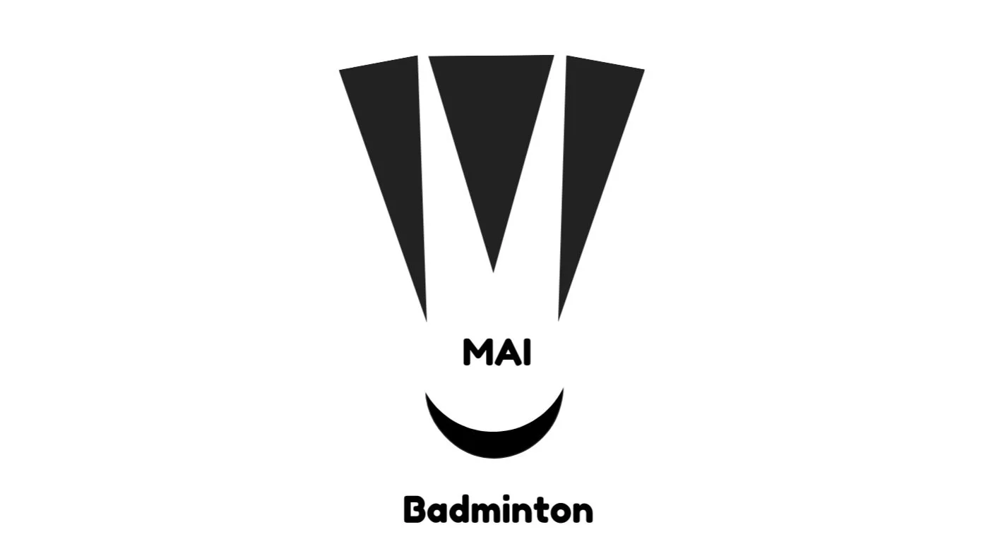
Guided by his vision and preferences, I designed and presented a final logo that reflected his goals. He envisioned a simple black-and-white color palette, with the birdie’s feathers elegantly forming the letter ‘M.’ The base of the birdie is represented by a semi-circle, symbolizing the smile often seen on badminton players’ faces as they enjoy the game.
The final logo.
This has now taken the shape of an emblem, proudly displayed on T-shirts and engraved on medals, signifying achievement for participants who wear and win them.
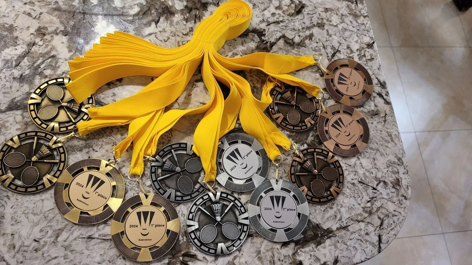
The medals with the logo printed on them, awarded to the winners.